Designing a UD and Accessibility Solution for The Iveagh Trust Website
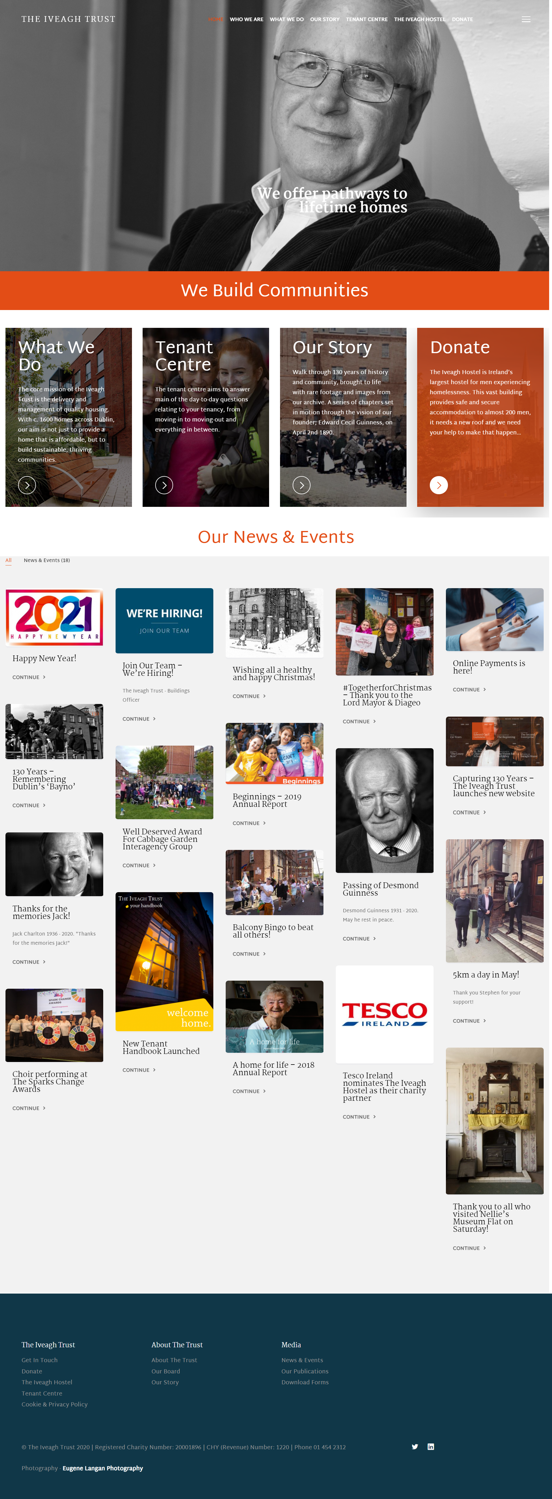
The focus was to address two of the most popular pages on the website, the Homepage and the Payment Page. Amendments to the homepage were initially sketched out:
Step 1 – Homepage Sketch
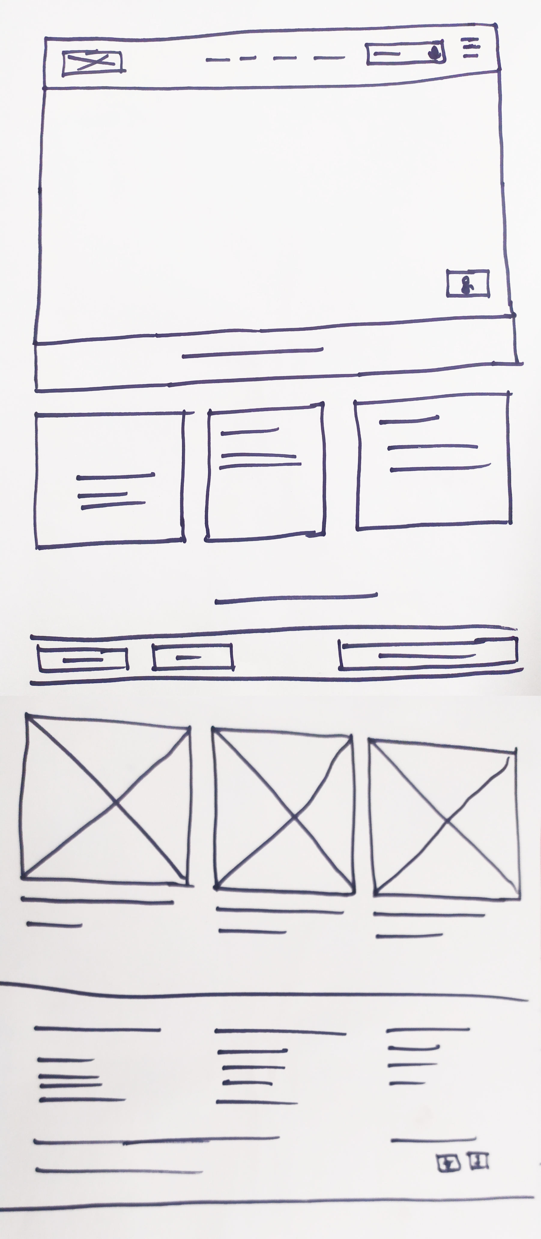
Homepage Sketch with changes to:
- Allowing the User to Pin Latest News to the Above the fold section of the site

2. Embedding Traditional and Audio Search Functionality into the top navigation of the site

3. Giving the user the ability to stop the video on the homepage (using the Accessibility icon)

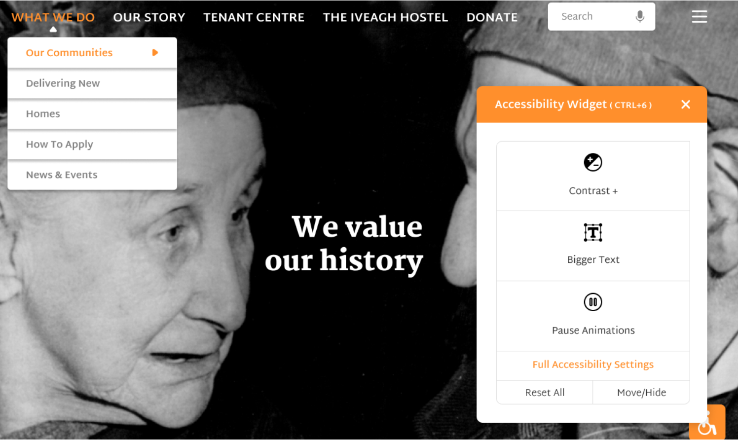
4. Embedding Accessibility Icons onto the header of the site (Contrast, Bigger Text and Pause Animation)

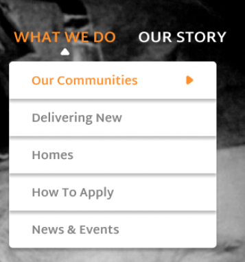
5. Signposting the Top Navigation Links
Step 2 – Wireframe for Homepage with Accessibility and UD
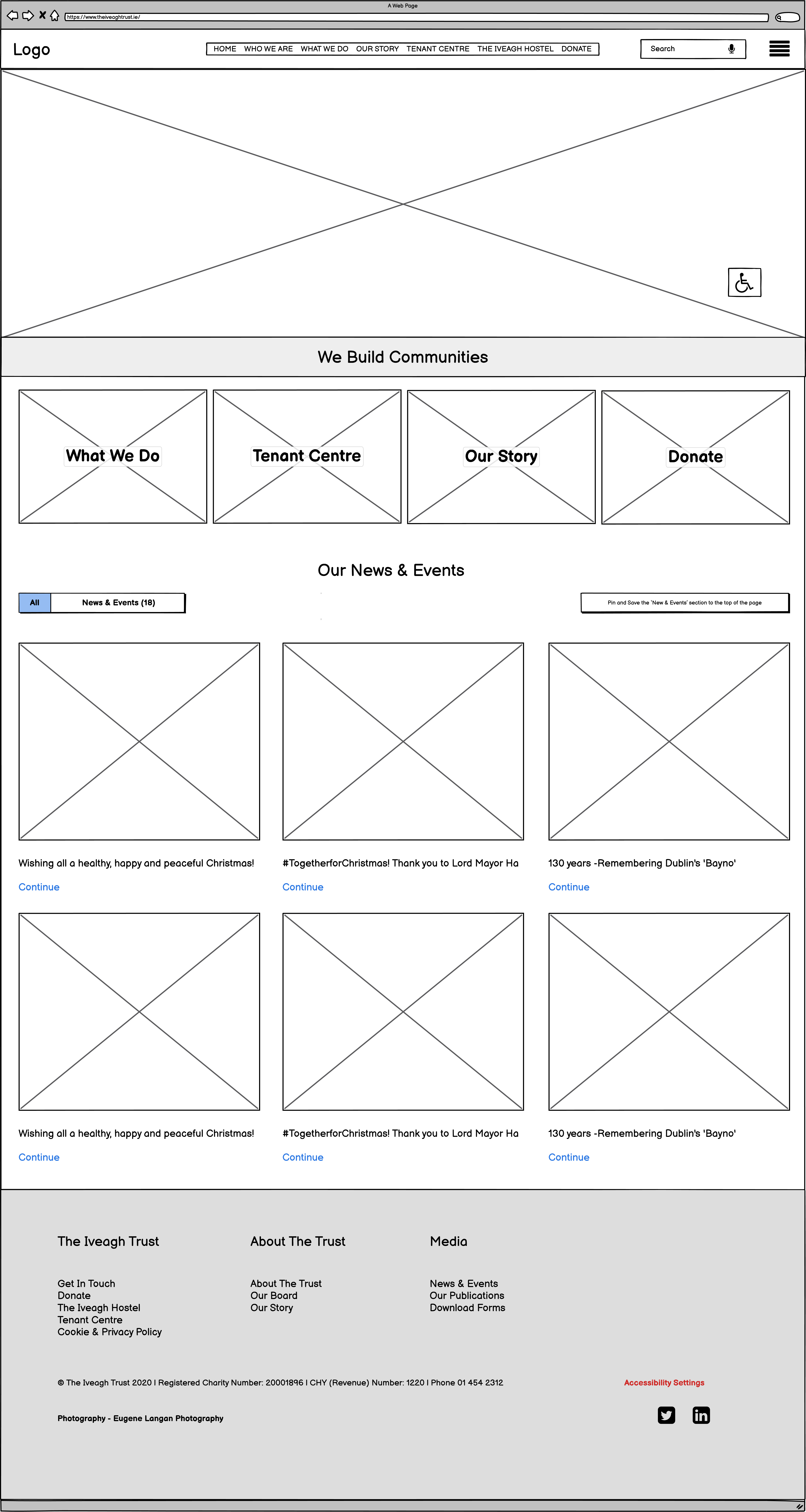
Step 3 – Homepage Redesign
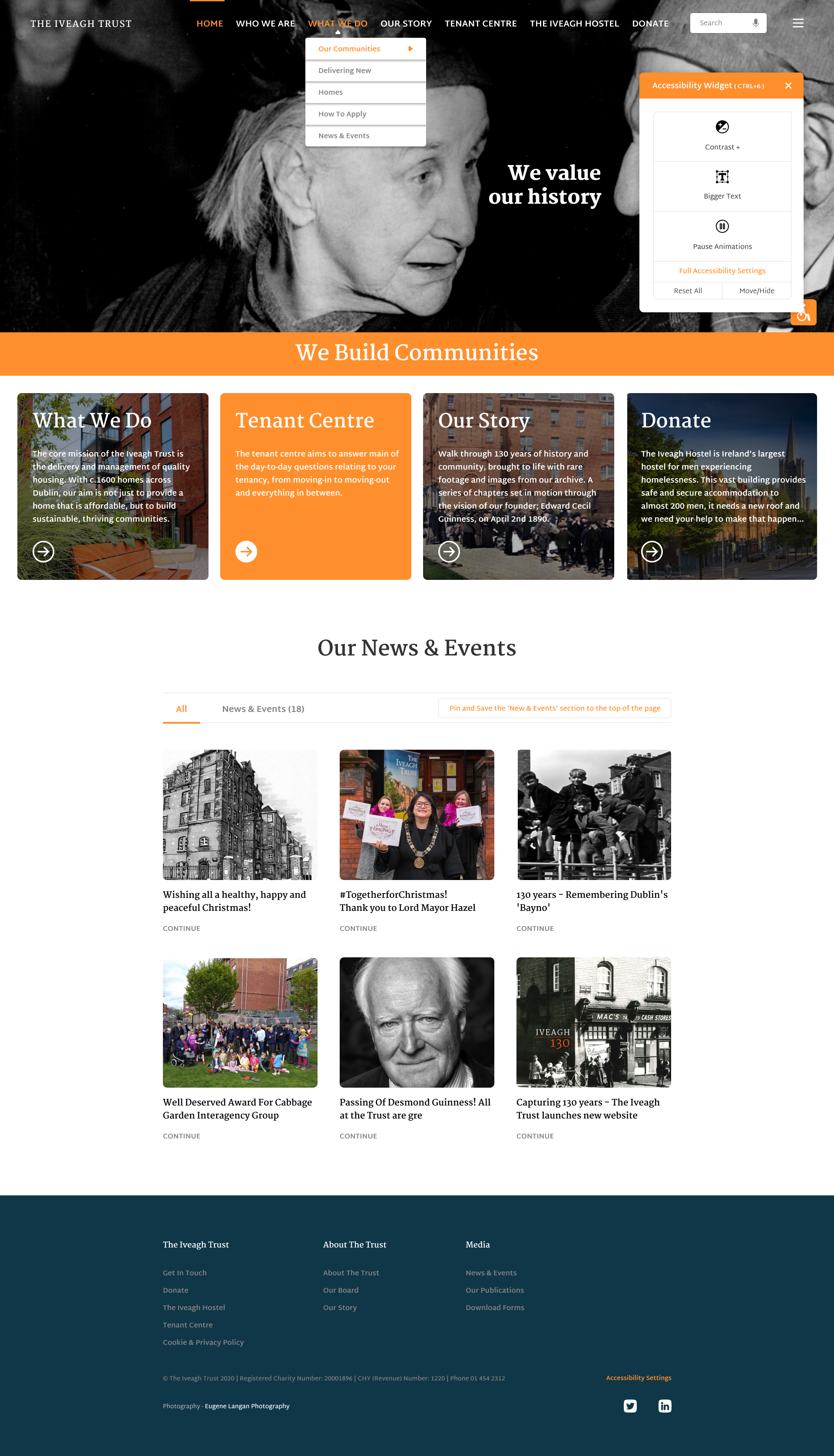
Note the Latest News section is now larger and is more con-formative rather than trying too hard to be cool and modern. Also, the information on the homepage currently has 20 articles, how current would they all be? Is 20 articles required? Reducing the number of articles should also help the page download speeds and another benefit is the length of the page is shorter.
Homepage Prototype Design, Accessibility and UD Featured Highlighted:
- Allowing the User to Pin Latest News to the Above the fold section of the site

2. Embedding Traditional and Audio Search Functionality into the top navigation of the site

3. Giving the user the ability to stop the video on the homepage (using the Accessibility icon)
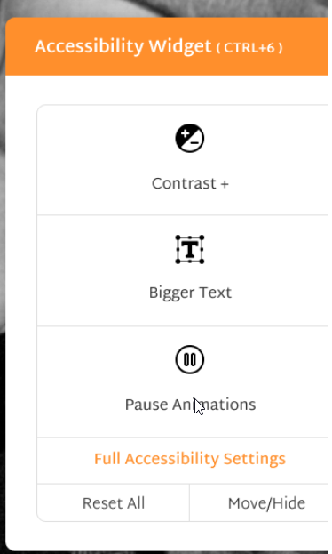
4. Embedding Accessibility Icons onto the homepage (Contrast, Bigger Text and Pause Animation)
![]()
5. Signposting the Top Navigation Links
Before and After – Homepage – www.theiveaghtrust.ie
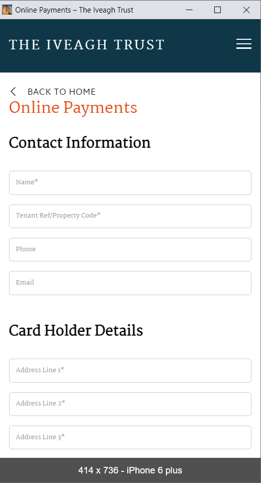
Mobile Interface – Payment Page
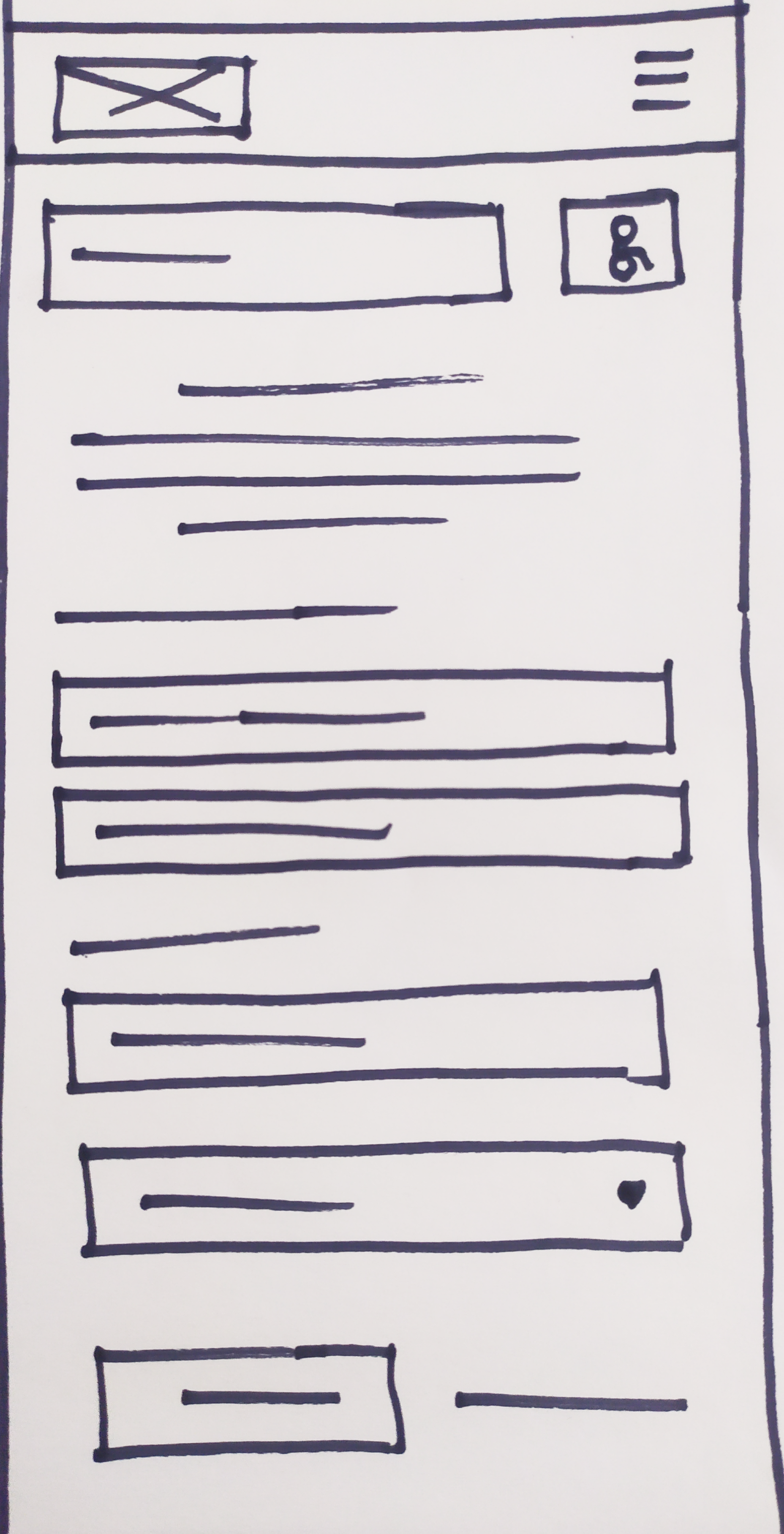
Step 1 – Sketch
Issues addressed:
- Descriptive Headings
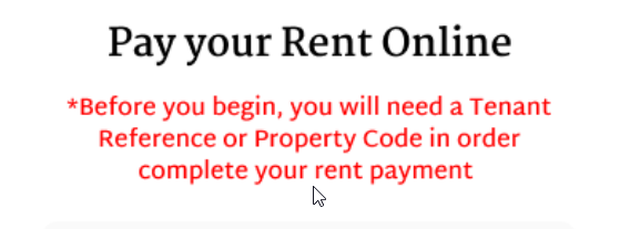
- Notice text before the user starts the form
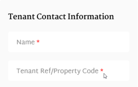
- Red asterisk
- Floating labels
- Digit interface for amount field
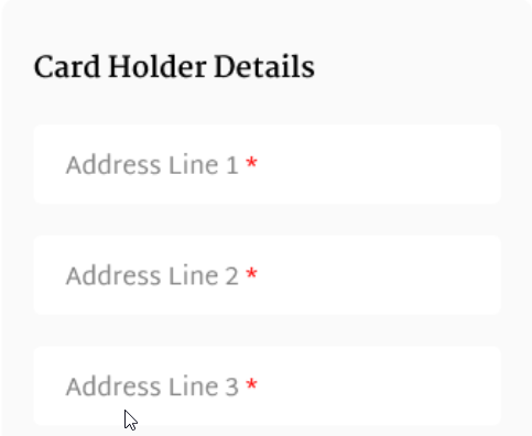
- Larger text
- Option to ‘cancel’ out of the process.
Step 2 – Wireframe

Step 3 – Redesign
Mobile Payment Page – Prototype Design, Accessibility and UD Featured Highlighted:
-
Descriptive Heading examples
-
Notice text before the user starts the form
-
Red asterisk
-
Larger text
-
-
Option to ‘cancel’ out of the process
-

-
Floating labels and Digit interface for amount field would be in the coded page.
Before and After – Mobile Interface – Payment Page
Conclusion
The final stage of the project delves into the potential strengths and weaknesses of the process employed and allows for some further critical reflection.
Comments are closed.

